Farm Kitchen
A refined, tactile sub-brand for Eversfield Organic’s farm kitchen and café—designed to feel special without relying on a large production budget.
Distinct enough to stand alone. Familiar enough to belong.
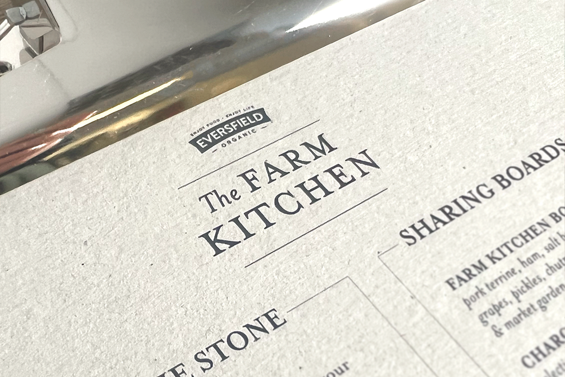
The Farm Kitchen needed its own character while remaining clearly part of Eversfield Organic. The brief covered the identity and the everyday pieces customers would handle and see: menus, signs, printed leaflets and table cards.
The budget was small, so the design system had to create a strong impression through disciplined choices rather than expensive finishes.
A refined palette with a grounded, handmade edge.
A characterful serif gave the identity a more refined presence. Dusty plaster pink and deep teal created warmth and contrast, while brown kraft card kept the work tactile and connected to the farm setting.
Typography
The type choices balanced a restaurant-like polish with an approachable, countryside character. Hierarchy stayed simple so menus and signs could be read quickly.
Materials
Kraft stock made economical print feel intentional. The material became part of the identity rather than a compromise, working especially well for table pieces and leaflets.
A small system designed to work hard.
The identity was translated across the practical touchpoints of the space. Each piece used the same typography, palette and material cues so the customer experience felt coherent even when individual items were produced simply.
Signage
A clear, recognisable identity for the café exterior and customer-facing spaces.
Menus
Flexible layouts with strong hierarchy for changing dishes and sharing boards.
Table print
Kraft table cards and leaflets that carried offers and provenance without feeling disposable.