Good Acre Farm
A self-initiated identity and website concept for a small biodynamic grower, built around the rhythms of the growing year.


Good food from a place you can get to know.
The concept assumes a small biodynamic market garden in Devon growing vegetables, herbs and some flowers, selling weekly seasonal boxes for collection at the farm gate.
There are two things to explain at once. People need to know what they can buy and how to get it. They may also be curious about the unusual way the farm works.
An identity shaped by the growing year.
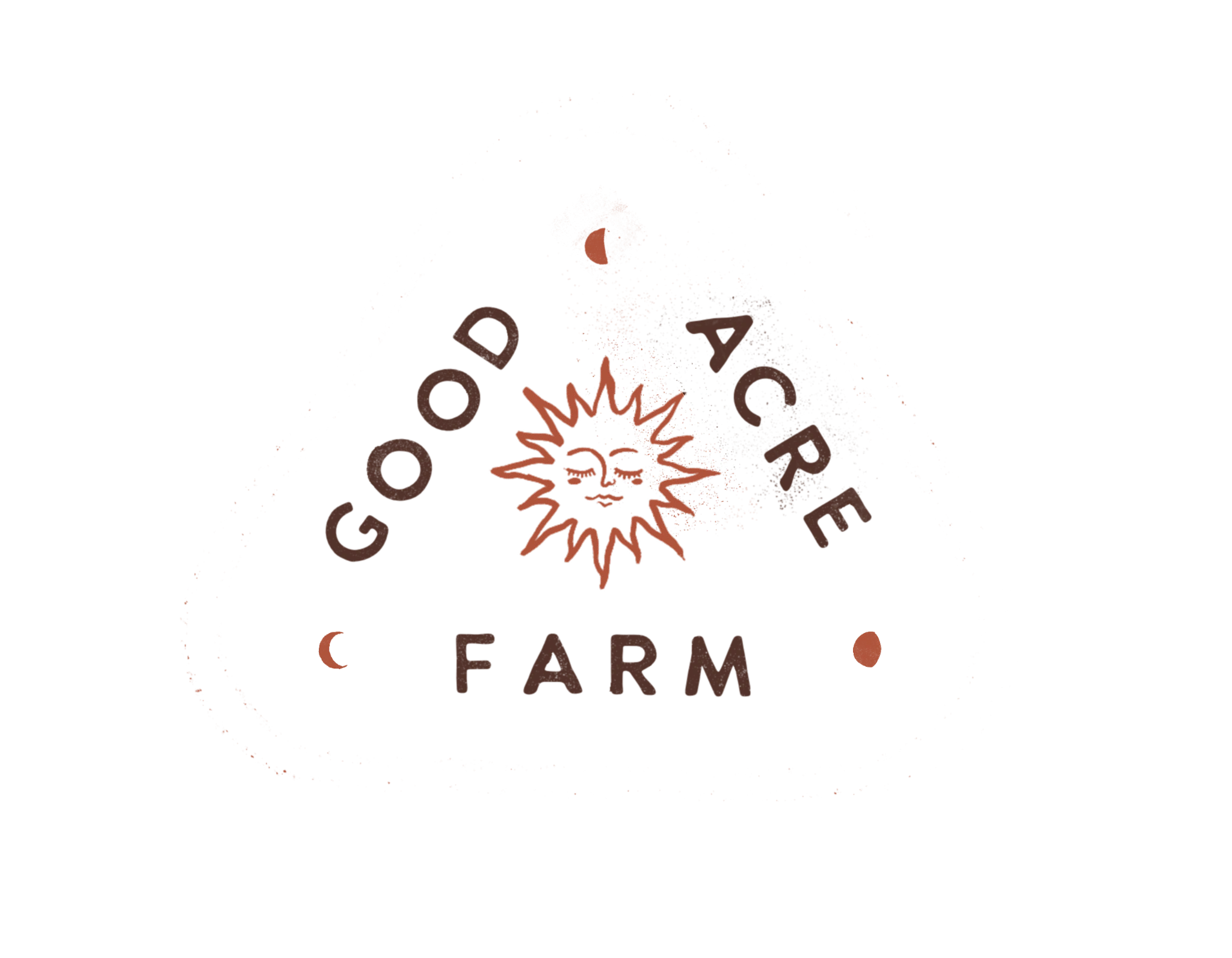
A compact stacked wordmark, hand-drawn sun and three moon forms create a flexible identity. Warm cream, earthy brown and terracotta connect the marks to the tactile character of paper and print.
A tactile, imperfect mark beside precise information is the interesting contrast in this identity.

From the screen to the farm gate.
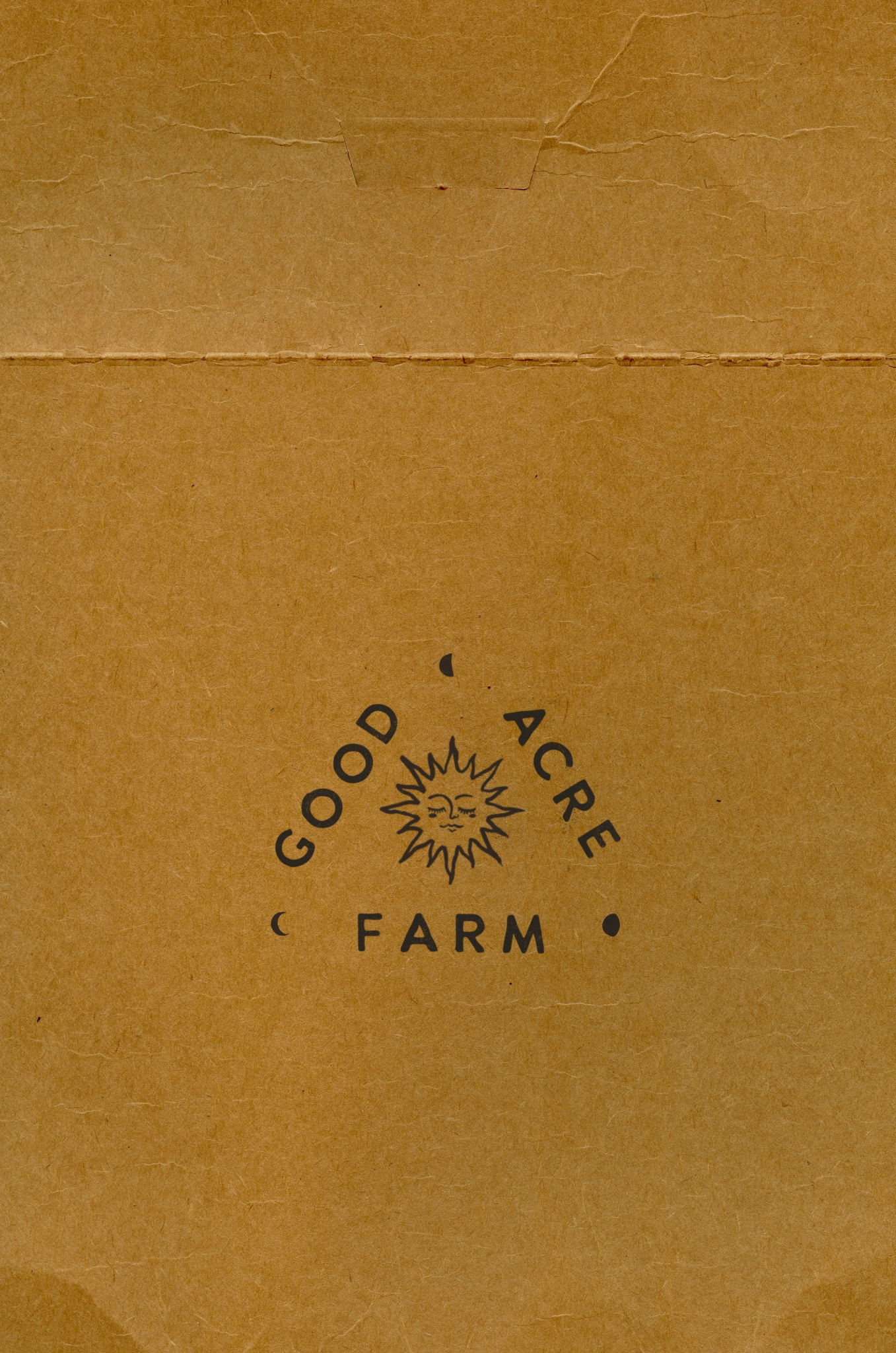
The identity needs to work wherever customers meet the farm: on a produce bag, a printed note or a phone screen. The same wordmark, sun and moon forms carry through each application.
The sun stamp and wordmark are shown here on kraft packaging and card, carrying the same visual character across physical touchpoints. These are presentation mockups for the concept.
The same character, translated to the web.
The homepage should feel like a visit: first a glimpse of the farm, then what is happening this week, then how to take some produce home. The deeper explanation follows once the immediate questions are answered.
The initial homepage concept carries the paper texture, compact wordmark and sun illustration into a quiet editorial layout. The next stage is to connect that visual direction with clear produce and collection information.
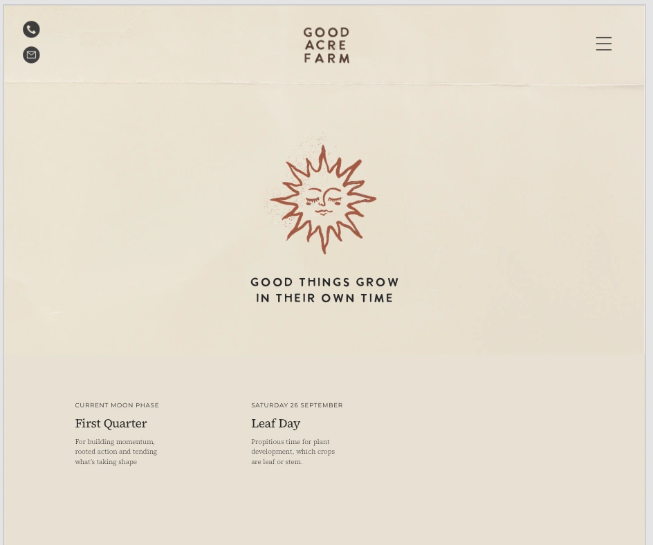
Initial homepage exploration · Static calendar content shown as part of the concept.
A visual foundation with room to grow.
The identity, packaging mockups and initial homepage establish the visual direction. Further development would focus on box contents, collection information and how seasonal notes work across screen sizes.
Good Acre Farm is a fictional business created for this self-initiated portfolio project.